
CENTRAL FALLS, RI – After six months of planning and collaboration spearheaded by the all-volunteer Branding Committee – made up of city leaders and community members – the City of Central Falls on Thursday officially unveiled its new rebranding and image celebrating its growing diversity and offerings.
“We’ve moved beyond our days of being known as the ‘Comeback City’ thanks to our hardworking families, businesses, leaders, and community members who have helped us grow and evolve in new ways. Today, Central Falls has endless possibilities, opportunities, and inspiration right here in our One Square Mile,” said Central Falls Mayor Maria Rivera. “As the most diverse community in Rhode Island, our many cultures, languages, and backgrounds offer so much to our residents, visitors, and economy, and we wanted to celebrate that on a greater scale with this rebranding. I’d like to thank our sponsors who made this celebratory rebranding possible without the use of any City dollars.”
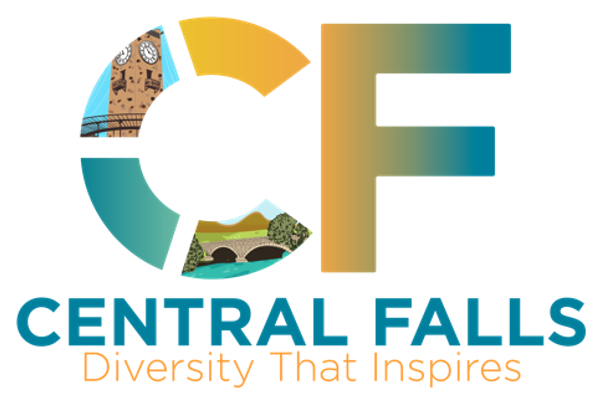
The City’s new tagline, “Diversity That Inspires” stems from the Branding Committee’s work in collaboration with Mayor Maria Rivera to strengthen the City’s urban identity and position Central Falls as the “Capital of Diversity.”
“I’m incredibly proud to be a community member here in Central Falls and part of this exciting rebranding process,” said Sue Levasseur, a lifelong city resident and member of the Branding Committee. “Across so many categories, our unique size, density, and diversity make us an incredible hub thriving in many areas. We have diversity across all categories, from ethnic, gender, generational, educational, cultural, and language to community, gastronomy, sports, identity, and more. We have Diversity That Inspires!”
Among the many colors in the City’s new logo, each element is representative of the City’s offerings: yellow represents the glow of prosperity and a new dawn for the City, green is the color of hope and appreciation for the environment, blue represents the local bodies of water and purity of Central Falls’ people and its new identity. The Jenks Park light tower represents the strength and resilience of Central Falls, and the bridge represents the foundation of the City and the clear future ahead.
“Our city is one of many different cultures and one that we are seeing progress on a day-to-day basis. This branding shows how far we’ve come and where we are heading,” said Councilman Franklin Solano, a member of the Branding Committee. “It was an honor for me to be part of the Branding Committee. As a council member I also make sure that we pay attention to city spending and I’m happy to say that this branding was fully supported by our wonderful sponsors.”
As one of the country’s most densely populated cities, Central Falls now holds a population of 22,583 residents according to the 2020 census, and is currently Rhode Island’s only “majority-minority” community, with two-thirds of its residents identifying as Latino.
“Central Falls is a city that has come a long way. Through the hard work of our community members and leaders, we became known as the ‘Comeback city.’ This beautiful city where many people call home, is now brighter than ever and rich with diversity,” said Council President Jessica Vega. “This branding is a celebration of how far we’ve come and our resilient spirit in moving forward.”
The new branding was made possible through generous community sponsorships without use of city funds, including sponsorships from the Rhode Island Foundation, Amica, Neighborhood Health Plan of Rhode Island, Telemundo Nueva Inglaterra, Navigant Credit Union, Tufts Health Plan, and Family Self Efficiency Foundation.
Signage across the City reflective of the new branding will continue to be rolled out in the coming months.